Everyman Theatre • Website
Improving book now opportunities to increase online ticket sales.
The Everyman Theatre initially approached 16i to help streamline the existing ticketing and content process, primarily to prevent show content having to be entered on multiple ticketing platforms. 16i have since continued to work as the Everyman's digital partner, helping to improve the website, drive sales, and most recently, ensure GDPR compliance.
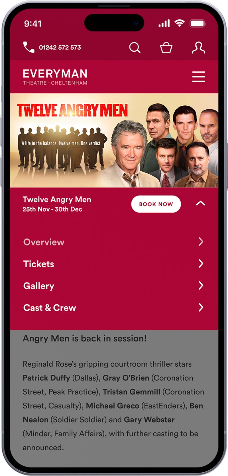
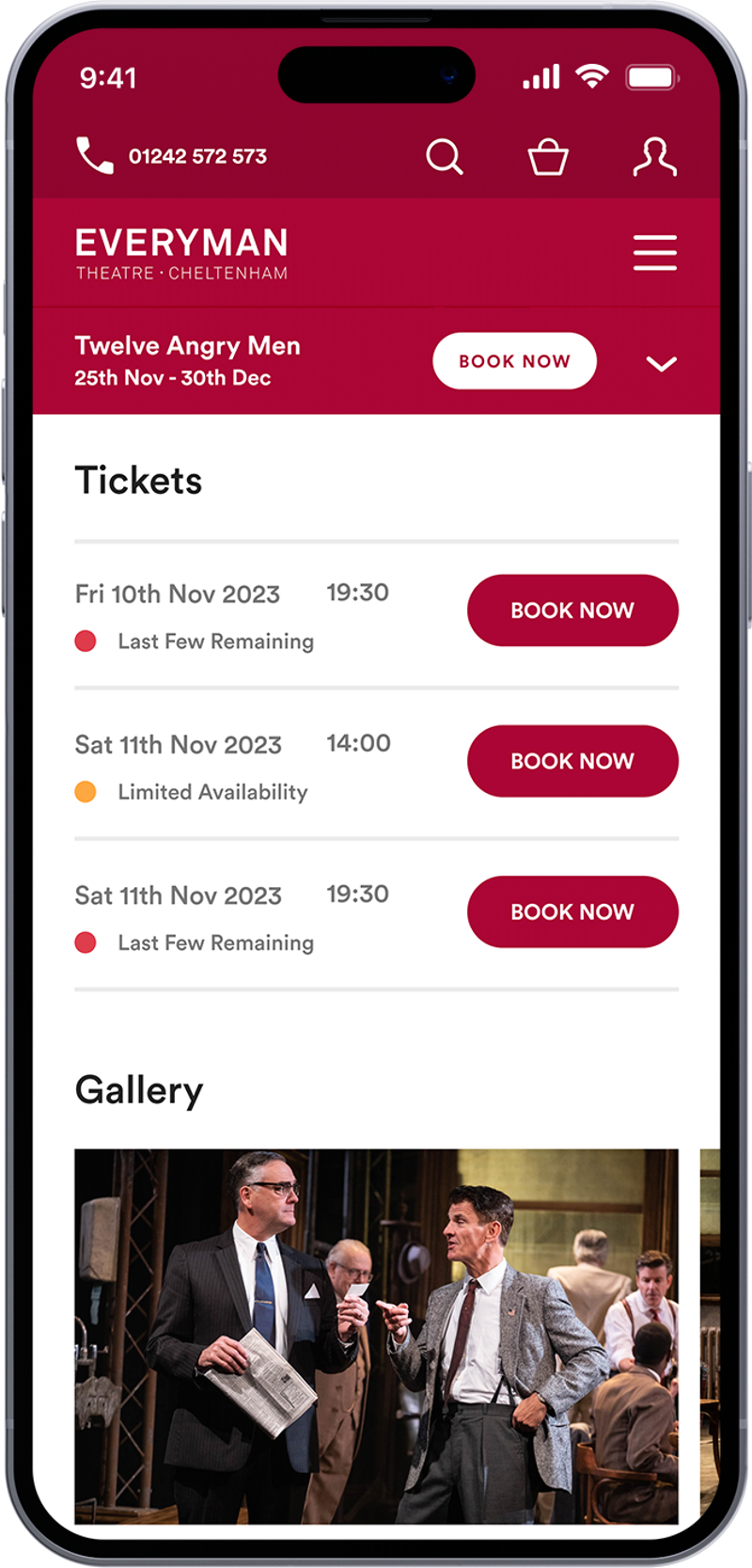
After many years of successful operation with the existing site we had created the team at the Everyman approached us looking for a minor update and refresh to the sites interface, with the primary goal of increasing online ticket sales from 25% to 75% and easing the users journey to purchase. As part of this we optimised the main menu design, improved card designs which included adding a 'Book Now' button, and adding a new sticky bar to events pages so the key details and 'Book Now' button are always present.


Making first impressions count.
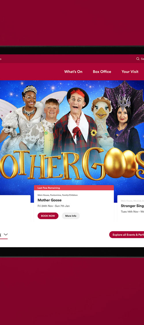
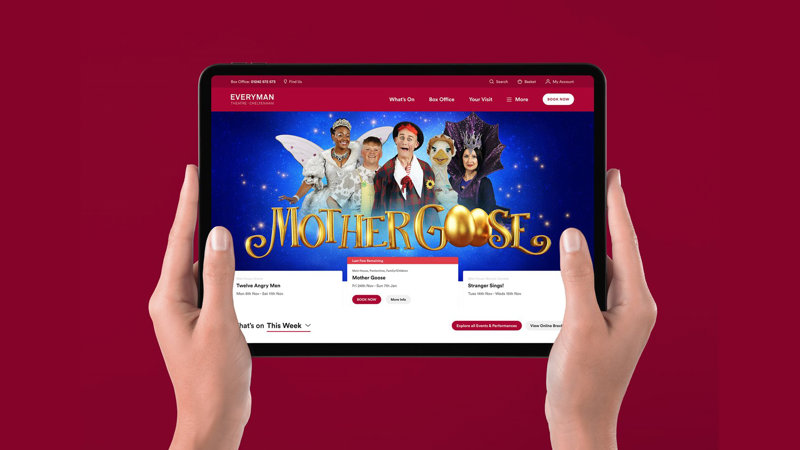
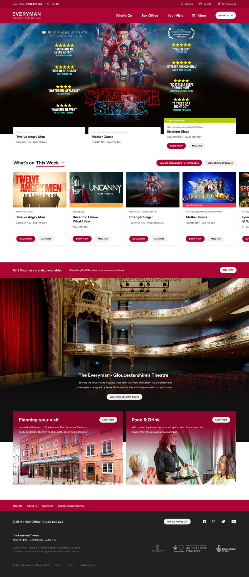
Designed to be as visually engaging and enticing as possible the homepage needed to encourage enquiries and ultimately drive ticket sales. We improved this latest version by removing elements that felt too minimal and weren't attracting a user's attention whilst adding more visual aspects that showcased what's on offer.
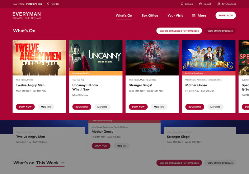
We improved the rotating hero banner with better cards that indicate the active slide, provide information on ticket availability and a 'Book Now' button that takes the user directly to the events ticket options. For other events the What's On section provides a filterable overview of what's coming up or explore the full catalogue of shows.
Finding events made easy.
A key part of the site is the ability for users to explore 'What's on' and find the latest and newest shows as well as plan for future events or shows they may want to attend.
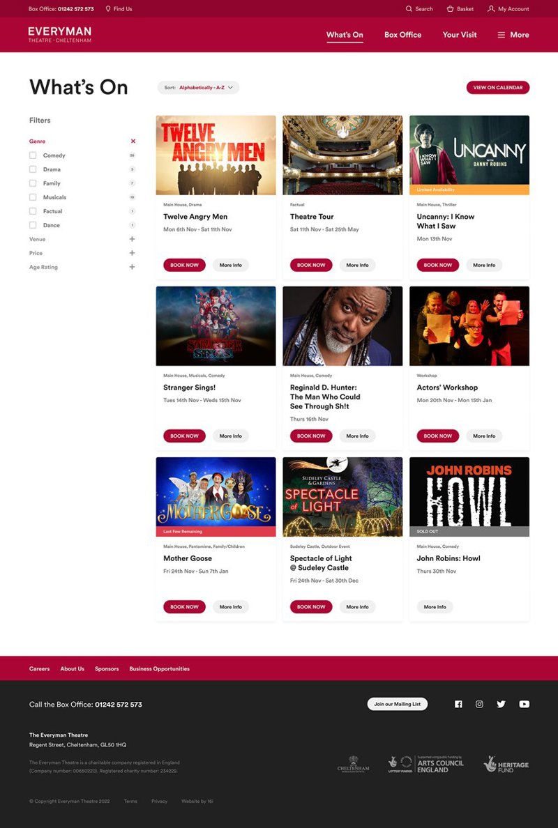
To achieve this we created simple but clear page featuring a grid of cards featuring key at a glance details that can be filtered by genre, venue, price and age rating; whilst clear call-to-actions prompt the user to view more information or 'Book Now'.
A detailed event overview.
The original format for the events was well structured and informative, it just needed some refinement to improve the user experience. We created an event overview bar which fixes in place on scroll provides all the key details for the event that a glance a user would need to know and help them decide if the event is right for them along with a 'Buy Now' button. The side navigation provides the user an indication of what content is available, where they are currently located on the page and as jump links that will take them to that section.

Improving the Main Navigation
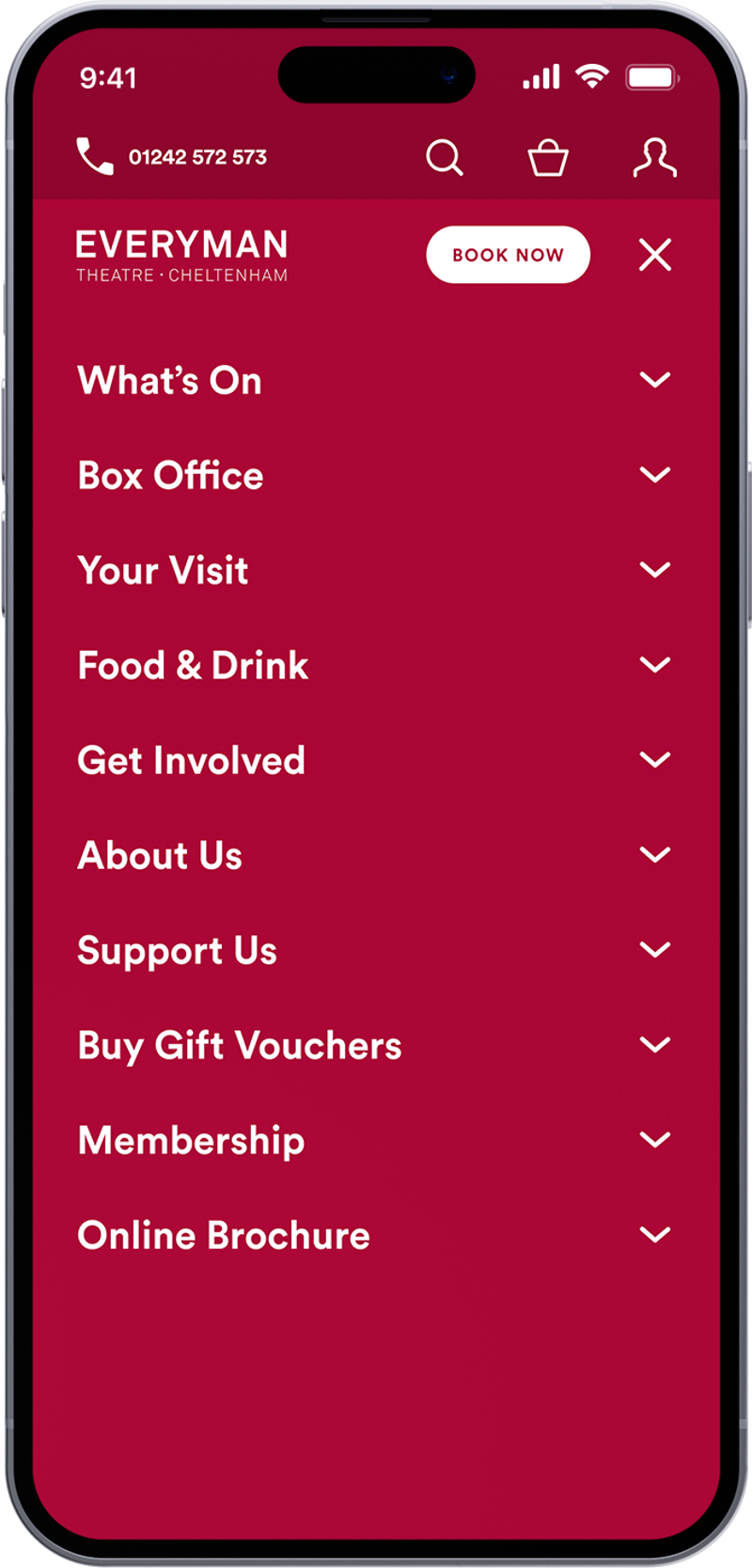
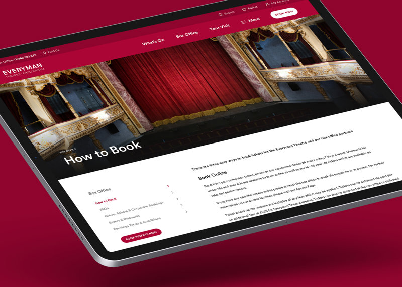
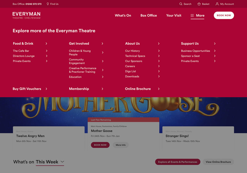
One of the areas we focused on with the design refresh was the main navigation. Over the years it had become bloated and top heavy with too many choices. We simplified this down to three key items: What's On, Box Office and Your Visit, all aimed at the users key experiences with the Theatre. Everything else was put into the More mega menu where we could show everything else more easily.
Responsive Web Development
With the responsive side we wanted to make the experience feel more like an app and similar to some of the big booking platforms. We wanted to make sure that the experience on mobile was as streamlined and easy to use as the desktop version, if not more so. Quite alot of the design rethinking and solutions devised came from a mobile-first philosophy, thinking what would work well on mobile and how will that scale to desktop.
